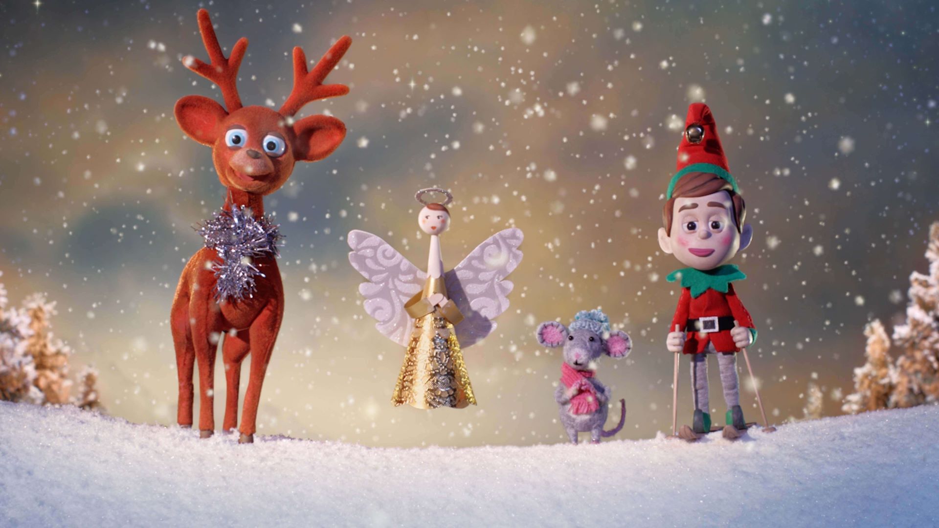
We all yearn for that nostalgic feeling from our childhood and when I think of Christmas, I’m personally reminded of the old-style cards with sparkly glitter and 1960’s tree decoration characters that I used to nick off the tree and play with. This combined with the memory of hearing Roni Spector pronounce Frosty as “Fworrrsti…” and I’m magically transported back in a reverie. It might seem strange to be speaking about Christmas in June, but as the festive scripts start rolling in this time of year, along comes that feeling.
Stop-motion animation has a magical nostalgic quality that links perfectly with Christmas. You can create refreshing, stylised worlds that feel familiar and parallel our own. I never tire at how magical it can be – when you breathe life into an inanimate object, and it comes alive for the first time. At Aardman, we specialise in stories and characters with humour in, and it’s often the scripts that give us the space to create extra funny moments that work the best. Usually, these moments are created in the storyboarding and animatic stage, where we visualise the script then embellish it. So often it’s what’s not in the script - it’s the gaps and the chance to create extra moments that excites us the most. If the script is wall to wall with action and dialogue and is not open to some kind of interpretation, it can be hard to add that special magic.
A few years back we did a Christmas campaign for Myer - a big Australian flag-ship department store based in Melbourne. We used traditional stop-frame animation to bring a set of nostalgic-looking Christmas decorations to life (yes, I channelled the old retro ones from my mum’s Christmas tree). The point of using stop-motion was to create vintage looking toys but with a fresh modern twist. The characters were made from a mixture of hard cast plastic, wool, paper, material and traditional flock. You may be surprised to hear that no clay was used in the making of Myer – which is the case for a lot of our commercial work.
The Myer script was about a bunch of Christmas decorations all arguing as they went off on a shopping spree to buy each other presents. The dialogue was natural and gossipy sounding and there was a nice offset between this and the undersized, clunky toys who are trudging through a winter wonderland (despite it being set in Australia). It was this weird juxtaposition that made it so interesting. The constant changing landscape meant that each new shot had to be a new set. So, the thing that took the most time wasn’t the actual physical animation, but the set build and dressing, complete with pinecones, snow and icicles etc.
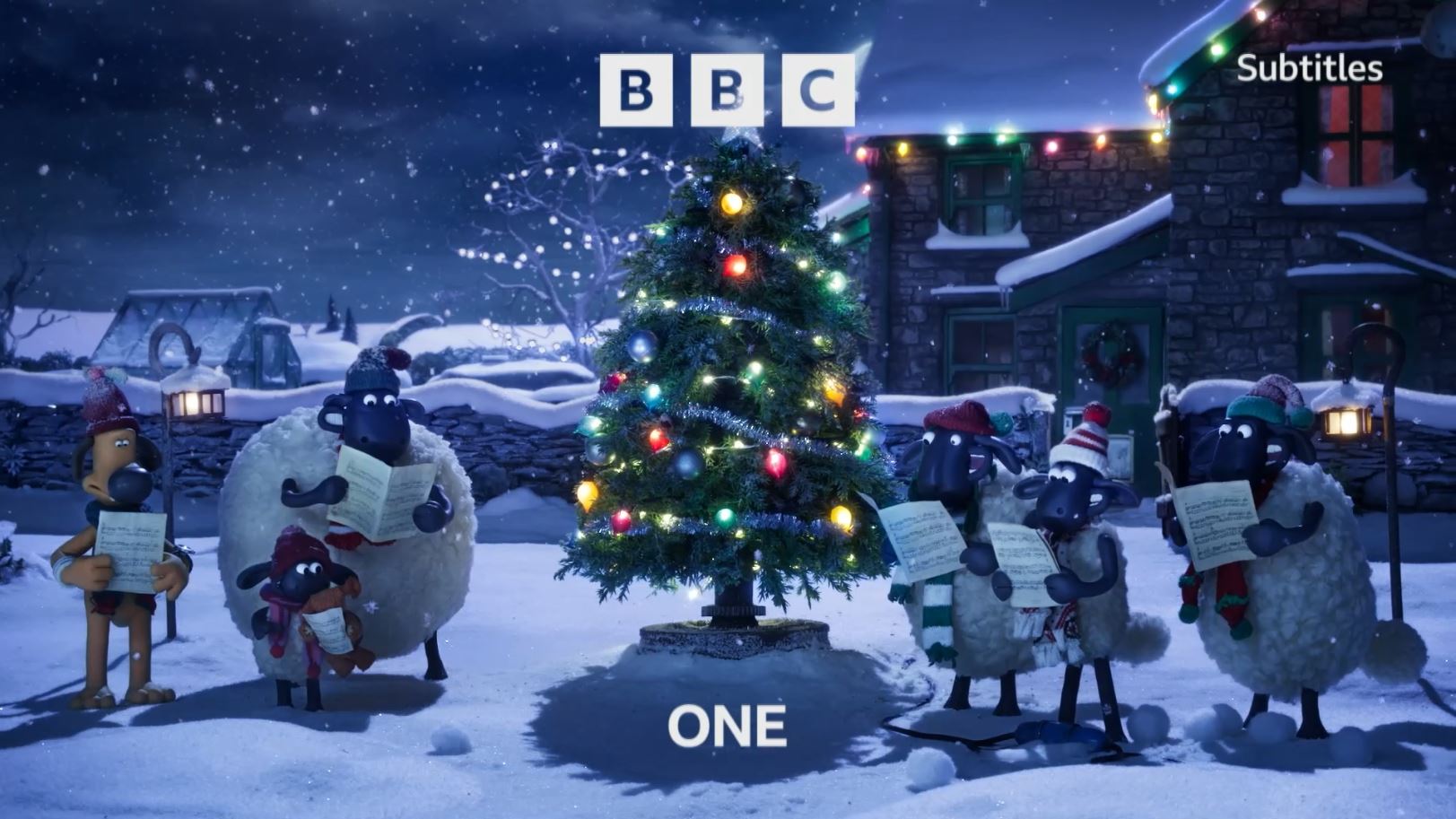
In contrast, the BBC One x Shaun the Sheep Christmas idents I directed recently were relatively contained, with only one set. The brief from the BBC was to create a sense of the family coming together for Christmas. The flock represents one big happy, slightly dysfunctional family with Shaun as the naughty mischievous child and Bitzer the grown-up who must always clear up the mess.
Although I’ve been at Aardman for over 20 years, this was the first time I’ve worked on Shaun the Sheep. I was attracted by the chance to do something tonally different with Shaun: something smaller, more natural and understated than usual. We were tasked to create three films, set at different times of the day. This was a dream brief as it also gave us the opportunity to free-form with the action as well as play with evocative, contrasting lighting.
Originally, we came up with lots of ideas: Shaun building an igloo and the flock partying inside, the flock building a snowman that turns into a snowball fight, etc. But in the end, we all went for the simple idea of decorating a Christmas tree in three stages, with the flock all joining in to help (or hinder). This was all very sweet and cosy, but we also knew it was important not to be too cute and still have moments of anarchy to balance it out. So, every now and then a sheep getting caught beneath a collapsing tree or someone getting a snowball in the face created a nice touch of humour - plus you can’t beat a bit of well-timed slapstick.
All three films were shot using stop-motion and a single unified arc-like camera move. The original idea was that these three scenes were meant to be layered up and combined together, but in the end, it was decided to play them out as separate films. I must admit that I was a little worried that they may look a little too simple on their own, but luckily the scenes were detailed and rich enough and there was still plenty going on. They really stood up as single films and the public reaction to them on social media was great, generating 600k impressions across the Aardman channels alone.
Steve Harding-Hill
Creative DirectorSteve became Creative Director for Aardman’s Commercials and Short Form division in 2016 and is responsible for the creative direction of the studio's partner content productions.
Get in touch
Have a Christmas script you'd like to discuss? Give us a shout!


