BRIEF
We were asked to create a little film for the company Ryse who make lovely green hydrogen fuel for busses. For us it’s always great to work on something that you think is a good thing, so it goes without saying that we were very happy!
The film needed to communicate who Ryse are and what they do, primarily for an audience of potential investors, but it also had to work for a wider audience online.
CONCEPT
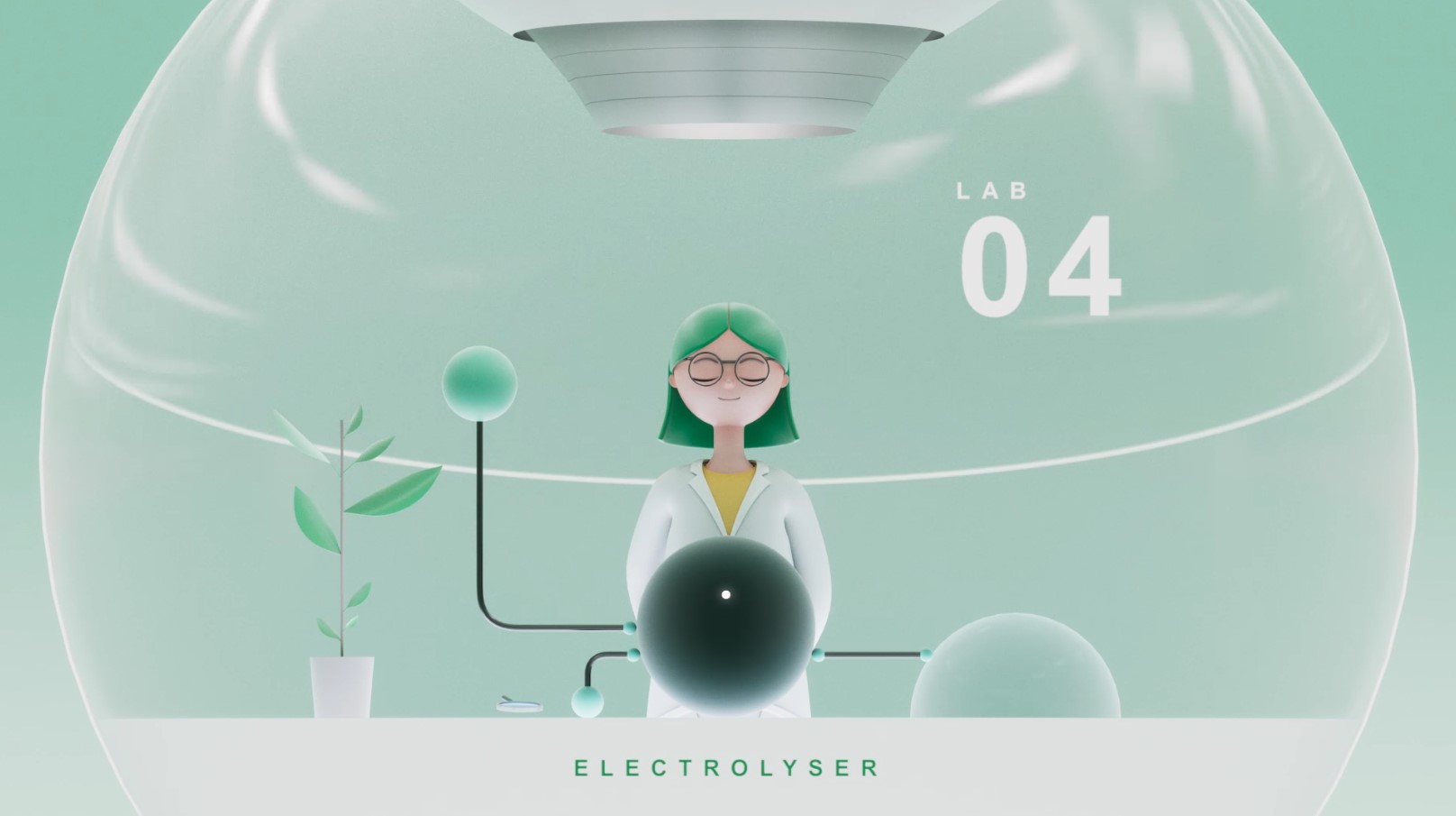
With a script already in place, the starting point was a visual one: ‘how can we make ‘sciencey’ graphics interesting and warm without losing the serious tone and communicate the benefits for the world of using hydrogen?’
My initial thoughts were about being slightly obsessed as a youngster with cut away illustrations. Usually of a giant ship or a volcano where it looked like they’d been chopped down the middle. On the science side they really effectively communicate information, but the detail also hints at a larger, imaginative world and gives a great scale to show what happens when pollution gets out of hand.
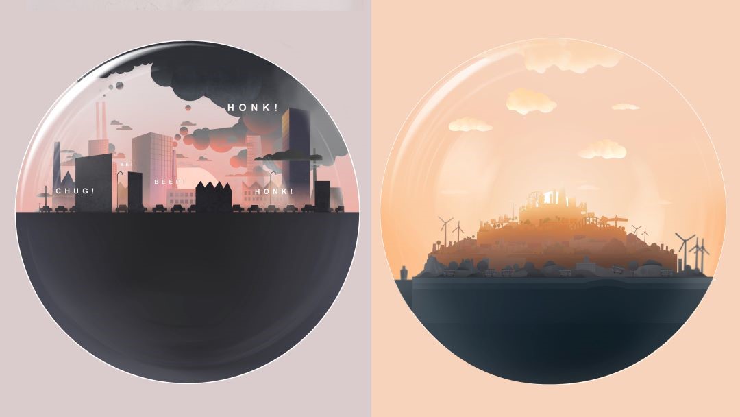
I also really like the graphic symbol for Hydrogen – it’s got that cool 1950s science feel and looks like a world with a moon. Combining the two inspired the concept: following a hydrogen bus driving through a little world in an ever rotating hydrogen atom – the inside of which can be lovely and pollution free or, without hydrogen, awful.
I was also looking at some ‘Hieronymus Bosch’ paintings at the time and I think ‘The Garden of Earthly Delights’ was a visual influence too!
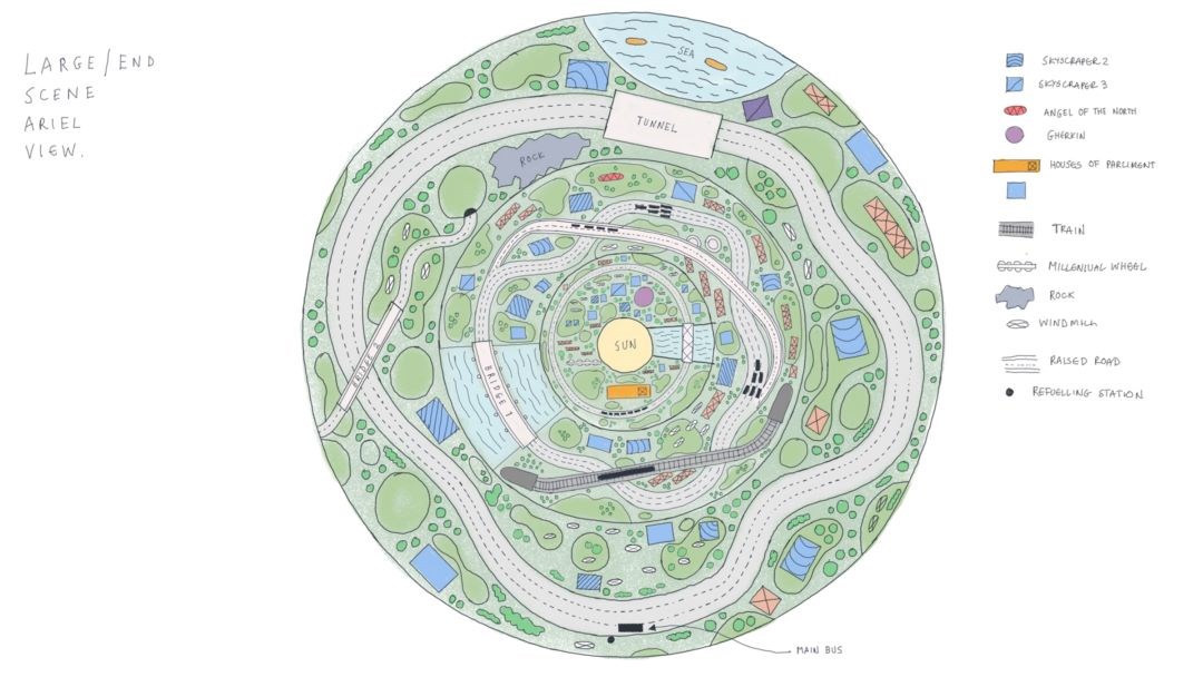
PROCESS
We felt CGI was the route to take for this project. I try to pick the production method based on what’s best for the idea, and that 50s futuristic science feel felt instinctively CGI but with a graphic feel, more like a diagram. This led us to stylised graphics, rendered in a way that feels like it’s really there – like the world is a little model in-front of us – tangible but also precious.

At this stage it was basically a race against time to make a film! I was mainly designing as a way to communicate to the team what things should look, or rambling about how something should move. This is the most fun part for the director. I create some illustrations, then hand them to a very talented team who come back a bit later with the idea fully realised in 3D, and it looks really good, simple! (If you ask the 3D team they might say it was a bit more complicated than that!)
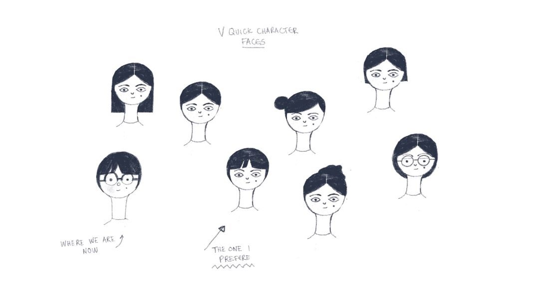
Check out the process reel below:
Dan Binns
DirectorDan is a Director and Designer at Aardman, involved in multiple development projects and has recently directed What's Up With Everyone, a campaign developed to help young people become more aware of their mental wellbeing.
Get in touch
Have a similar project you'd like to discuss? Leave your details below:
