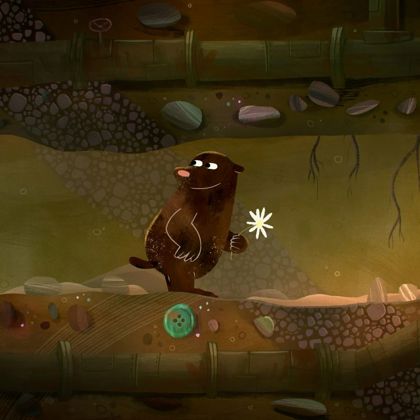
‘There’s a Big Bad Wolf’ was based on the wonderful poem by Blue Peter Amazing Authors competition winner Phoebe.
The Amazing Authors competition is a collaboration between BBC Studios Kids & Family, BBC Arts and The Reading Agency, which gives young writers a fantastic opportunity to have their stories brought to life as a book and a short animated film.
Story
I was genuinely so impressed by 10-year-old Phoebe’s poem. It was funny, intriguing, and hit the right balance between being slightly spooky, adventurous and sweet. It was a cohesive tale, with a clear beginning, middle and end. Exactly what you need to create a successful story or film. There was even a little surprise, a cliff-hanger at the end, which made it even more endearing.
Visual Language
Seeing as the winning story was going to be made into a book as well as a film, I felt that it would be great if the visuals had the tone and visual language of a children’s picture book. My thoughts and inspiration shifted to the wonderful art by the late Ronald Searle and Quentin Blake, and how their distinctive ink line feels expressive and alive.
It was that expressiveness that I wanted to capture, as well as creating a language that was both charming and a little rough around the edges. A look that would mix a hand drawn line and loose, digitally painted backgrounds with textures to give it depth and interest.
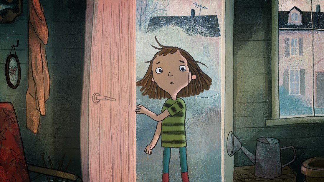
With these thoughts in mind, we set out to create a rich two-dimensional world using a hand drawn look with layered textures and brush lines, creating something hand-crafted and magical. We put emphasis on the humour and performance of the characters, creating a nice balance between the subtle darkness and the comedy of the story.
I thoroughly enjoyed establishing this style that started from the world of picture books, but developed into perhaps something richer, detailed and more suitable for animation yet still holding onto the language of the picture book world.
Once we started production the lovely Designer Anh Cao joined me creating the backgrounds, bringing her charm and colour skills to the table.
Character design
The Wolf
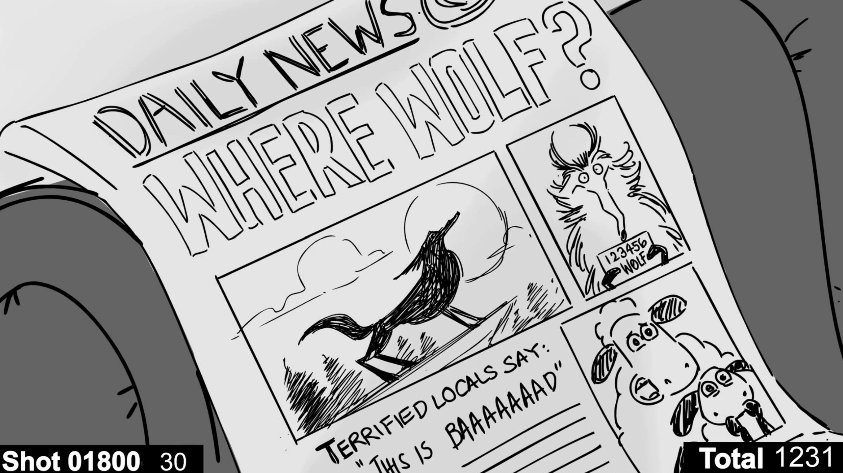
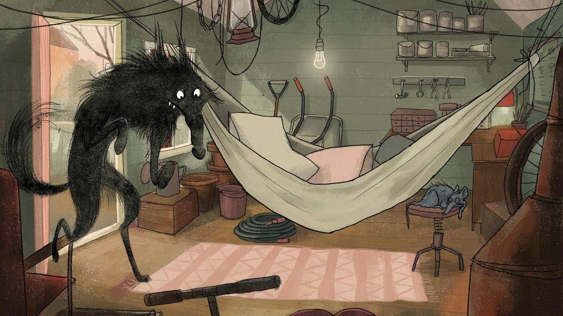
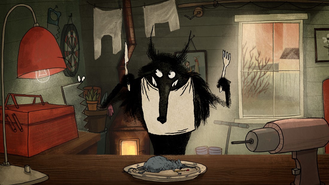
The wolf was so much fun to design. I wanted to give him a lot of character and edge. I deliberately wanted to keep the design loose, highlighting his scruffy, slightly spooky nature. All the while giving him humour and a goofy side to his performance and facial expressions.
The Girl
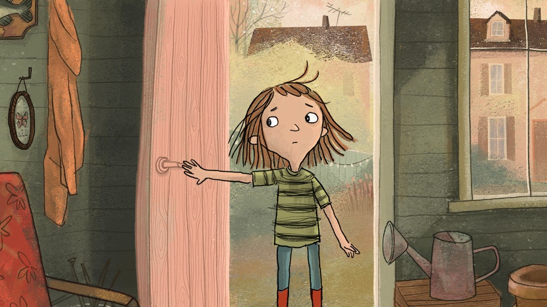
The girl has an edge to her persona and quirkiness to her design. I saw the girl as being a tough cookie, with simple design features, yet full of charm and expression. Visually I wanted her character to have the same looseness of a sketch, including a boiling line, textures and highlights that weren’t perfectly filled in.
Storyboard and animatic
Together with the brilliant Storyboard Artist Althea Aseoche, I loved figuring out how we could enhance the sense of adventure and make the environments feel exciting and visually interesting, as most of the scenes took place in the girl’s bedroom and in the garden shed.
This part I thoroughly find delight in, to map out the story on a timeline, but also to create the undertones of the story, to add details that are not in the script but enhance the story and give it depth. This was then brilliantly edited together by Dan Williams and Victoria Stevens.
Animation
I love how often your initial sketches for a character can have a language and a charm that feels very natural and alive. It’s a looseness that doesn’t feel contrived. And it was that expressiveness that I wanted to capture in the character design as well as the animation. I was very keen to try to animate the film in a hand drawn frame by frame style.
This of course is fairly time consuming. With limits in terms of budget and time we needed to be quite clever in how to achieve this in the most efficient way without losing the charm and quality I was after.
So, we brought on the wizard that is Henrique Barone, who is a brilliant 2D animator, to do some testing. Knowing our limitation and the wanted look, he came up with a workflow for the wolf, that included animating and drawing the lines of the wolf in Animate, then taking it into Photoshop to paint in the textures frame by frame, and the final step was After Effects where we applied some filters. But the big conclusion was that for us to save time, we could animate the character on 3s (in most places). This was of course time effective, but mainly we realized that animating on 3s instead of the usual 2s was much more pleasing for the eyes. Animating on 2s made the textures feel too hectic and hard for the eye. So, it worked in our favour on all levels!
Once we had decided on the look and style of animation we brought on the rest of the fabulous Animators Javier Ibanez Garcia, Paulina Juarez Mandujano, Geovani Vazquez and Olly Montagu who each brought magic to the table in terms of movement and style.
Another incredibly important part of a team is of course the Producer, who was the awesome Danny Gallagher and Production Coordinator Chelsea Galloway. They are the key to projects running smoothly and responsible for managing the whole production process.
Finally, the Compositors swoop in. Spencer Cross and Peter Phillips, as well Bram Ttwheam for the grades, made sure everything was composited together nicely as well as enhancing the colours, effects, textures and the final look.
Music
I was delightfully thrilled with what Daniel Whibley composed for the film. I think he so perfectly captured the balance between spookiness and the enchanted tones running through the film. He picked out the humour and he set the tones for the slightly sinister wolf. And he sprinkled just the right amount of whimsical sounds. It was then truly magical to see it being performed by the BBC Philharmonic Orchestra.
BBC Philharmonic Orchestra
Stepping into the big room at BBC studios in Salford where the BBC Philharmonic Orchestra play and record their music, you feel so humble and in awe of their craft and skills as musicians. And how utterly gorgeous it sounded when they performed.
Blue Peter at Aardman
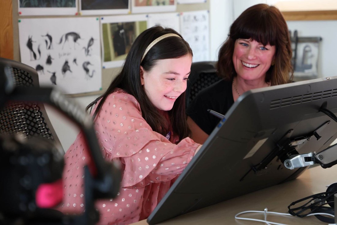
Part of the experience for Phoebe was also a trip to Aardman HQ in Bristol, where she saw a sneak peek of the film, and got to step into the sound booth to record some sound effects for the girl in the film.
Åsa Lucander
DirectorOriginally from Finland, Åsa moved to London in 2001 and joined Aardman in Bristol in 2014, where she is now based. She was first drawn to illustration and from there her passions developed towards moving images.
