Director Peter Peake goes behind the scenes of Home, our short film for Save the Children, explaining the creative process behind the project.
Purpose
This short film is aimed at the alarming number of children around the world (in this case aged 8-12) who are displaced from their homelands due to the many circumstances facing refugees such as war, famine and persecution. It seeks to recognise the problems they may face settling in a new and often unknown country with potentially a completely different language, culture and set of customs to contend with. We touch on the feelings of isolation and loneliness that can become part of experiencing life as an outsider and aim to offer a message of hope and reassurance that acceptance can be found even in the most disparate of places. Personally, I’ve never been involved in a film with such a compelling reason to be made.
Despite the gravity of the subject, Save The Children were keen that the tone of the film should be one of hope rather than a bleak depiction of the refugee experience. They very helpfully provided us with first-hand accounts from children who were forced to become refugees. Many of the stories were utterly heart-breaking and the idea of deriving any positive, hopeful outlook from them seemed at first a little daunting. However, these personal accounts were so powerful and affecting that it quickly made me realise the desperate need to offer some form of comfort to anyone going through the same experiences. If there was any way to provide a reassuring hand on the shoulder through this film, any glimmer of hope and positivity to pass on, then that was its purpose.
The film was to be shown globally and potentially to children in refugee camps across the world. It was therefore important that it should have a universal appeal, avoiding reference to any specific conflicts, countries or races. This also meant that we needed to avoid dialogue in order for the film to be understood by people of all languages. The characters would need to communicate through gesture and expression alone.
Story
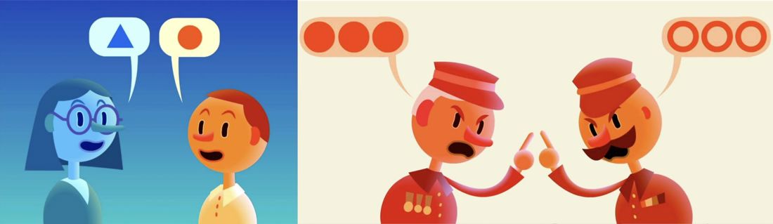
I was instantly intrigued by the challenge of universal communication without words and how this could be depicted visually. The idea of using speech bubbles containing contrasting symbols came pretty early on and helped to portray communication and lack of understanding even if we weren’t quite sure what the characters were saying.
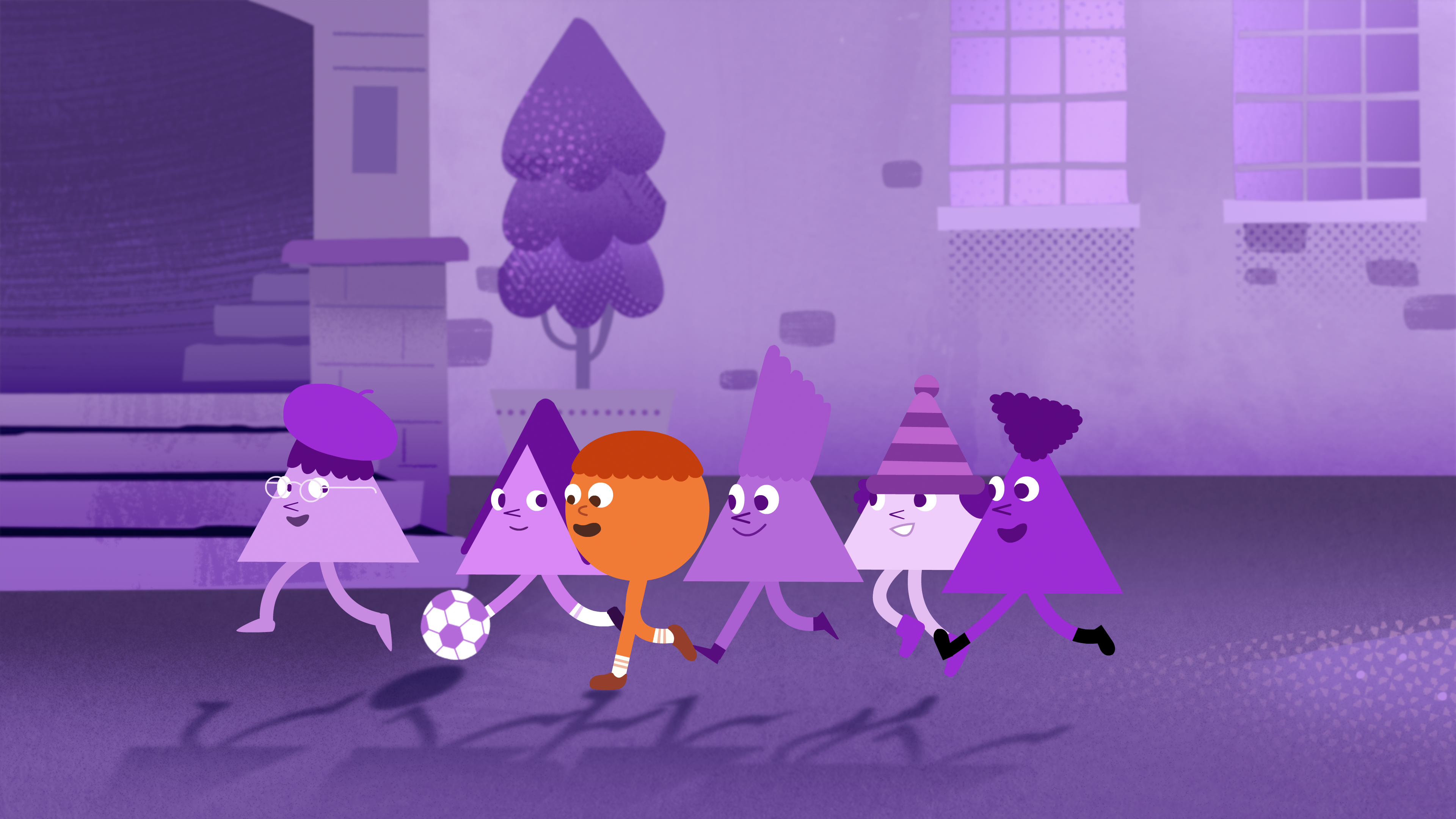
The big thing for me was how to portray the main character of the refugee child as ‘standing out’ but in a way that becomes a positive to be embraced rather than something to be wary and ashamed of. Colour seemed an obvious path to explore but keeping to the idea of universal appeal we didn’t want to depict any particular human skin tones. Instead, taking a more abstract approach, I chose colours that were distinctly ‘not human’ which instantly provided us with a basis for the look of the film. An idea formed of a world that consisted of only one colour with a child arriving who instantly stood out by being a totally different hue. I thought we could construct a world that was still quite beautiful despite being monochromatic but one that becomes richer and more varied as refugees’ colours spread throughout it.
Save The Children were extremely positive as we developed the script and commented that not only could it relate to refugee children but to any child that was feeling different and separate from the crowd. It was really encouraging to think that our message might have an even broader reach and could potentially speak to anyone that was experiencing the feelings of being an outsider.
Even though we wanted to strike a positive, hopeful tone with this film at some point we of course needed to refer to the tragic circumstances that brought our protagonist to this new place. I actually think the slightly playful look and feel of the film up to this point gives the flashback sequence more impact and surprise. I guess when the audience thinks you’re leading them in one direction it’s a bit more powerful when you briefly change course. I remember what a ‘gut punch’ I felt after watching Ricky Gervais playing essentially an embarrassing clown for two series of The Office until the final episode where he breaks down and pleads for his job back. It’s that unexpected element.
I’m pleased that this turned out to be one of those stories that can only really be told using animation. I don’t think you always necessarily need to justify the medium you’re working in but when it feels like a good fit I think it can strengthen the message.
Characters
We presented Save The Children with a selection of character designs and they very quickly responded to ones that were based on strong, simple shapes. Reflecting the contrasting symbols that the characters create in their speech bubbles became another striking point of difference between our protagonist and those around them. We opted for a circular character in a world of triangular inhabitants. STC were also keen that our characters appear gender neutral, again to keep the film’s appeal as wide as possible.
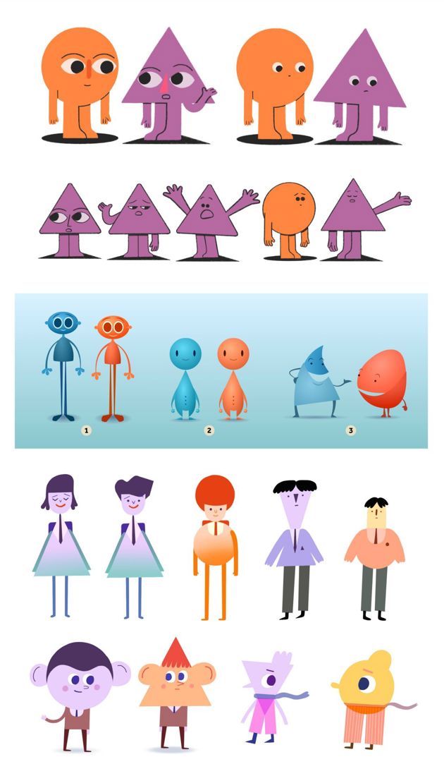
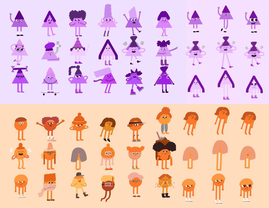
Dan Binns came up with our final character designs which were wonderfully simple yet full of charm and expression. He provided us with a wide range of characters based on triangles and circles that were nicely individualised with a range of accessories and cool hairstyles. We discovered that we could differentiate between child and adult characters by the placement of their faces on their bodies. Younger characters would have their features placed more centrally whilst older ones would have them higher up.
Process
Given that the characters were so simple I wanted their environments to be more richly detailed in order for them to contrast and stand out against them. This also helped to skew the look of the film a little older and more sophisticated to appeal to our 8-12 year-old target audience. Up to this point I’d worked with illustrator/artist Graham Carter on pitches that hadn’t materialised but we’d never actually worked together on a fully commissioned job before. Being a massive fan of his beautifully stylised and textured work, I jumped at the chance to ask him to create our backgrounds which, luckily, he was very happy to do. I was delighted with the world he created for our story’s setting.
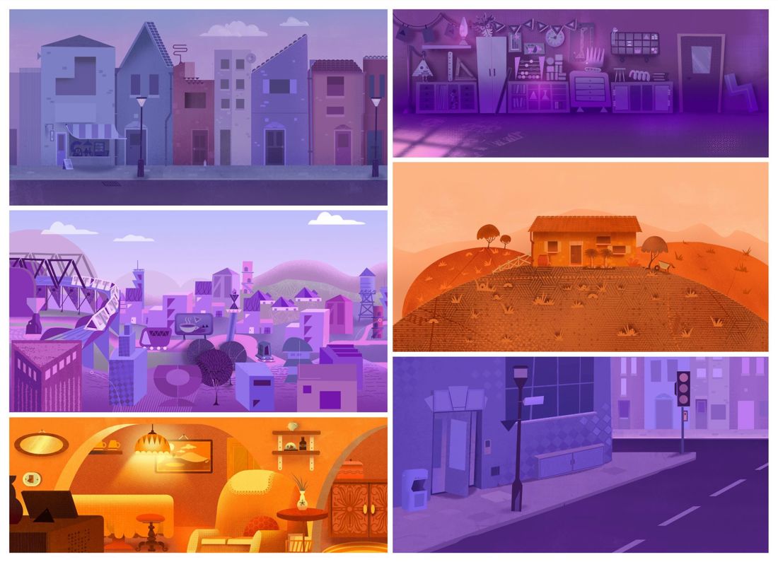
Kim Alexander and I animated the film using Adobe Animate. I was hugely impressed with how Kim picked up the style so quickly and was able to get so much out of it. Often really simple characters can be tricky to nail as every little inflection reads in volumes. Coupled with the fact that our characters were unable to speak it was an interesting and fun challenge to make sure their performances conveyed the necessary emotions and intentions. Our animation was then combined with Graham’s backgrounds in comp where the multi-talented Dan Binns added lighting, shadows and other effects to give our 2D world much more depth and atmosphere, setting a look that took it to another level.
I was very pleased that my long-time collaborator Alex Lupo was able to compose the music for our film. His sensitivity to mood and pacing was invaluable in enhancing the quickly changing emotions of the film. With no dialogue the music was pushed all the more to the fore and of course Alex had to avoid the score taking cues from any particular cultures or parts of the world.
This was a fantastic project to work on and a really great opportunity to support such an important issue. It was a pleasure to collaborate with Save The Children whose help and guidance was invaluable. Hopefully we’ve created a short film that will help in some way to make children who feel ostracised for their differences begin to embrace them and in turn feel proud of them.
Related content

Royal College of Art announces plans for new Animation MFA programme in partnership with Aardman

From Clay to Coin: The Royal Mint Celebrates 50 Years of Aardman with a 50p
Crafters Unite for Shaun the Sheep's 30th Anniversary
Behind the Craft: Thatchers Juicy Apple
Behind the Craft: Darcy's Tale

Behind the Craft: Shaun the Sheep x Lush

Holding attention: Three campaigns that kept fans hooked

Crafting Stop Motion Magic with VR Technology

Behind the Craft: Comic Relief Red Nose Day x Aardman

Behind the Craft: Wallace & Gromit in The Grand Getaway

Behind the Craft: Blue Peter - Amazing Authors

Behind the Craft: Thatchers Cider

Behind the Craft: Save the Children - Home

Behind the Craft: RSPB - Time Flies

'Ask Me Anything' with Aardman's Simone Giampaolo

Behind the Craft: Chocapic Trust

Behind the Craft: Wetland Heroes

Behind the Craft: Legends Family Adventure