Behind the Craft: Morph Thingy-Ma-Bobstacle Course
Morph Thingy-Ma-Bobstacle Course is a gesture controlled game for Sky Live, where players use their body to help Morph dodge, jump and roll on an endless treadmill of tricky obstacles and epic boss-battles!
Bringing a game to life is a process that involves thousands of decisions. Some decisions are small, which on their own may not be noticeable, but they work together with many other small decisions to improve the game – an example might be colours of our buttons or the timing of an animation. Others are the BIG decisions, such as what animations a character needs to perform, the difficulty of the game or what colour shoes we are going to wear to the launch party. In this blog I’m going to take you through some of the decisions, both big and small that were made in the process of designing, developing and delivering Morph Thingy-Ma-Bobstacle Course, which you can play now on Sky Live.
At Aardman, and especially within the games and interactive teams, we work on a lot of things. You may not be aware of how many different types of projects, brands and clients we work with, but it’s a lot! The variety of the projects is something that fuels us, and the ability for the team to approach projects from a variety of angles and expertise is one of our big strengths. This project really is no different to the many others we’ve developed, as we’d be mixing the usual cocktail of requirements as we would on many of our projects; working with new hardware, targeting a specific demographic of users, working with a global brand, interesting gameplay mechanics and an existing and beloved IP.
A new platform
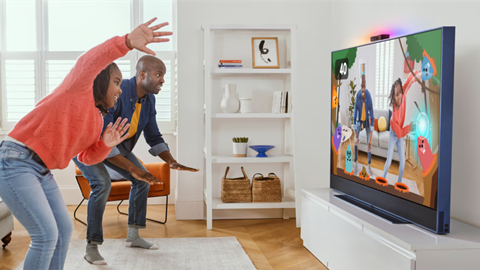
We’re often put in the position of being presented with a new piece of hardware, along with the proposition of making something for it. Some of those experiences are more positive than others. If I needed to present a more positive example of that situation, then working with Sky on their new Sky Live camera would be one such example. Here was a new piece of hardware, but one that was understandable and had already had careful consideration for how content would be made for it – and it was also designed to be an add-on accessory to the already brilliant Sky Glass TV. It was new, but not unknown.
Choosing the right technology for the job
As ever with new projects, there’s an early decision that must be made about what we’re going to use to make it. We’re blessed with experience across several technologies. Whether it be Unity, Unreal, Web (HTML5 & WebGL), Roblox, Flutter – the list really does go on, we make sure we take the time to choose the right tool for the job. One of the primary considering factors that goes in to choosing the technology we use to make an interactive project is the technical capabilities of the hardware it will be running on. Another factor is whether we're going to be rendering the experience in real-time, and the level of fidelity required. Taking all those factors into consideration, we chose to use Unity to build the game. Unity’s scalability to run on almost all hardware, from mobile devices to next-generation consoles gives us the opportunity to deliver a great looking game that we know will perform well on our target hardware.
Invasion of the body-trackers
From the outset, Morph Thingy-Ma-Bobstacle Course was going to be a game that would utilise the body-tracking capabilities of Sky Live. What we had to do is understand firstly, what were the limits of the hardware in terms of detecting movements and gestures and secondly, how could we use that information to make a fun game. From a game design perspective, the gestures the user would have to perform was the way we were connecting the user to the on-screen action – so it was super important!
![]()
Technical Director Mark Burvill testing out the body tracking capabilities of Sky Live
In some games, players have ‘agency’ over the characters on-screen – the goal is to combine human player and the digital character in to one as closely as possible. The player needs to feel as though they ARE the character on screen; that when the player presses a button on a controller it transposes the thought processes and feelings of the player into the game world – all of those thoughts, feelings and intentions are then manifested into the movements and actions of their controlled character.
It can all seem very complicated and high-brow, but, that’s NOT what we wanted to do with Morph. Why? Quite simply, Morph is Morph. Me, you or anyone else can’t be Morph. We wanted to make sure that the user is clear that they weren’t being asked to play a game AS Morph, but WITH Morph.
![]()
An early test where users could control Morph directly by moving their arms. This isn’t what we wanted.
Going back to finding out what we could do with Sky Live’s body-tracking capabilities, we initially drew up a list of over 30 unique gestures that the user could perform. This included expected gestures such as ‘left arm out’ and ‘right arm out’ and more exotic gestures such as ‘cactus’, ‘taxi’ and ‘ballerina’. What we learnt here is that the body tracking and gesture recognition capabilities of the Sky Live platform weren’t going to hold us back.
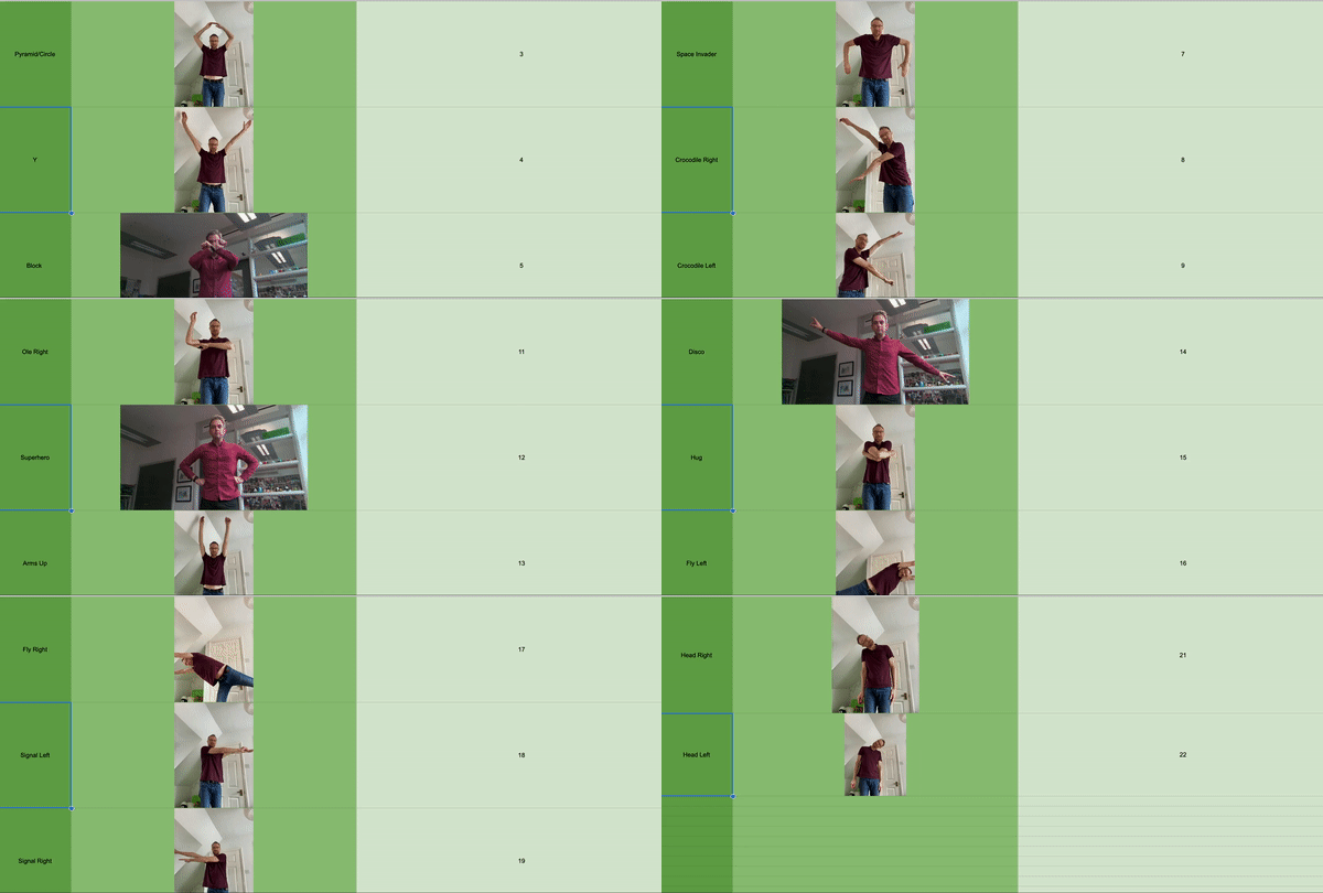
Some of the moves and poses we initially tried out during the prototyping phase.
If there’s one thing that a team that primarily grew up in the 90s know, is that it’s important to stop and think just because you could do something, doesn’t mean you should. Who knows what the world would be like if we all took a moment to heed the words of Dr. Ian Malcolm from Jurassic Park...
Taking our list of 30 gestures, we then put each one through our ‘yes, but what does it MEAN’ filter. What does the user doing a ‘cactus’ shape really mean in the context of our game. Does Morph turn in to a cactus? If so, why? Morph is a character that can turn in to anything, but there’s always a reason why he turns in to something. He lives in the same world as we do, he just has a special power to...well, morph!
As we went through the list of gestures, we realised that what we were doing was determining the language in which the user would communicate with Morph – effectively the player would be asking Morph to do something.
If we were to transpose our list gestures on to a controller, or an iPad, what would feel comfortable to our target audience? If we were making an app for a tablet or a games controller, having 30 unique inputs would be crazy. We could only really expect the user to hold in their head and process a handful of inputs – so, our 30+ gestures eventually become four.
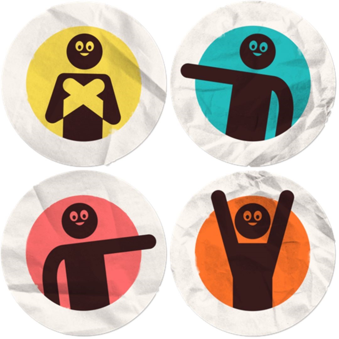
The four gestures we ask the user to do, and the UI graphics that represent them within the game.
Our final list of actions were ‘left arm out’, ‘right arm out’, ‘arms above your head’ and ‘arms across your chest’. These would be enough gestures to allow Morph to perform all the required movements to navigate the obstacles on the treadmill.
From modelling clay to polygons
Taking a physical, real-world character and making it digital is a multi-disciplinary skill. It’s a LOT of work. There’s not only the task of replicating the physical proportions of the character so that the eyes, mouth, hands, feet etc are the right size, correct shape and in the perfect position, but there are also the textures and materials to consider, which play a massive role in getting Morph to feel ‘right’.
The overall silhouette of the character can look correct, but if a digital Morph doesn’t look like he’s made from modelling clay, then it isn’t Morph. If the animations aren’t right and Morph doesn’t walk like Morph, again, it isn’t Morph. As the developer on the project, here’s where I can say I didn’t have to worry. Sure, I don’t have to do the 3D modelling, UV unwrapping, texturing, rigging, skinning, shader writing and animating to bring our digital Morph to life – but that’s not why I didn’t have to worry... The reason I didn’t have to worry is because I knew who would be doing it and where they were... and where they were was about a 30 second walk away!
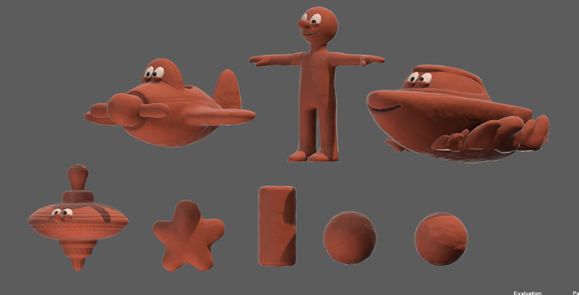
The 3D models of Morph, and the many shapes he becomes within the game.
This is where the Aardman that you might first think of, the Aardman that makes Morph, Shaun the Sheep and Lloyd of the Flies, meets the Aardman that makes interactive projects. We have an amazing CG team here. They can turn their hand to anything. There are so many things that you might have seen on TV or in films that you don’t realise came from here. If there was one thing that was a certainty about this project, it was the fact that Morph would definitely look like Morph. Sure, there were specific considerations to make for this digital version of Morph that we had to get right. Firstly, it had to be performant, so meeting certain requirements for the amount of polygons was key, as was how the character would be rigged (the underlying ‘skeleton’ that is used to animate digital characters), but the ability of the team meant that meeting these requirements had no impact on the overall output and look and feel of Morph.
Another huge string to our bow when it came to making Morph into a digital character was how the animations would be produced. The challenge was to replicate the way in which Morph moves as a real-world, modelling clay constructed, physical character into the digital character. Step up, Inez Woldman.
Inez is an animator here at Aardman. That sentence is in itself accurate, but is an incredibly irreverent way to describe the skills that Inez has and brought to the project. See, not only did Inez animate Morph for Thingy-Ma-Bobstacle Course, but Inez has also animated the actual, real-world, physical Morph. The one you see on TV. Inez knows how to make Morph. If there was anyone that we would have wanted to animate our digital Morph, Inez was that person. The speed at which the creative process around animating Morph for Thingy-Ma-Bobstacle Course proceeded was extraordinary. A simple direction for a required animation such as ‘trips over low toy block’ would come back within hours as a blocked out animation with huge amounts of character – allowing us to really understand how it would fit in to a game and continue to flesh it out. Once we agreed the animation would work, Inez would go back and complete it.
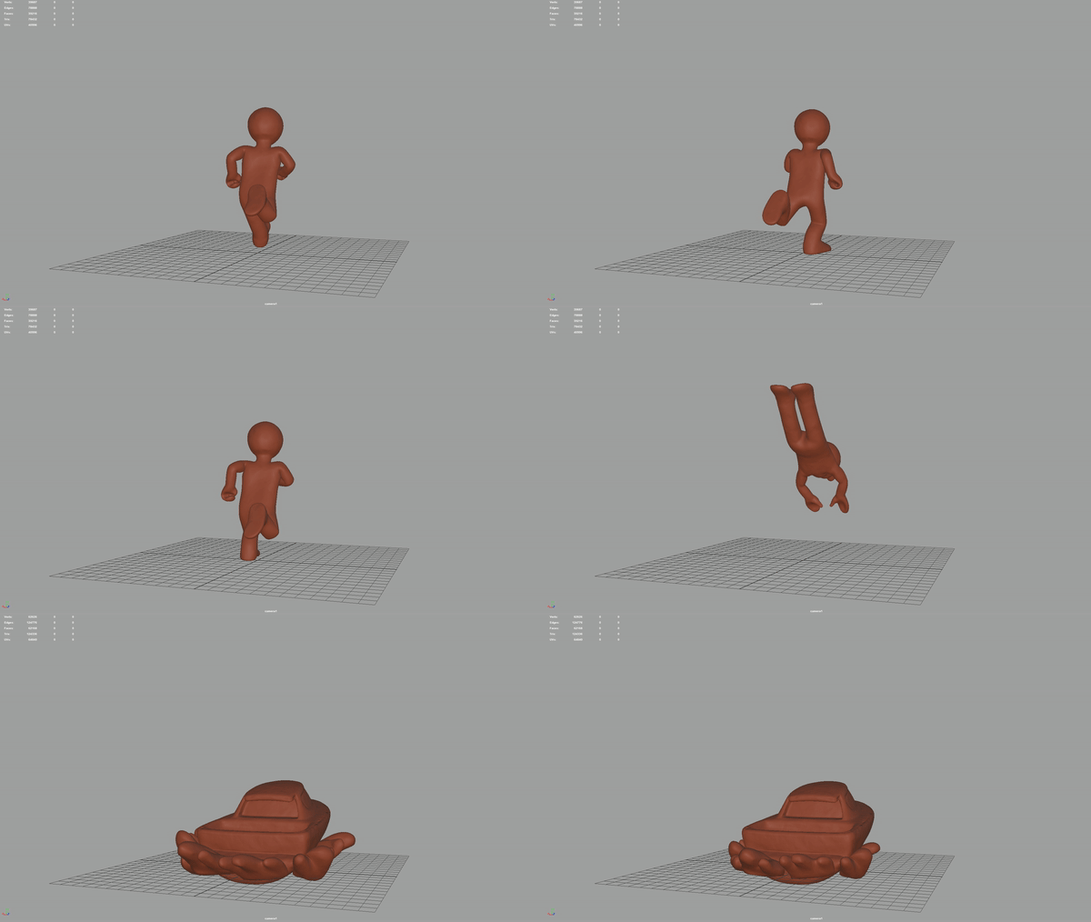
An animation test for how Morph would transform into the Boat
An incredibly important factor when it came to animation was how not just how Morph would translate into a digital character, but how Morph would work as a character IN a game. Animations are sometimes boiled down to simple terms like ‘jump’, ‘walk’ or ‘throw ball and then react to sound of glass smashing...’ - sorry, flashbacks to breaking my parent’s greenhouse when I was younger. We can picture those actions and sort of know what to expect, but bringing a ‘jump’ animation to life doesn’t simply mean moving the character up in to the air and wiggling the legs around a little. It’s all about the anticipation, the slight bend of the knees, the beginning pump of the arms – the subtle change of the face to emote an increase in effort. It’s a holistic, full-body action. So much of it is in the ‘unseen’.
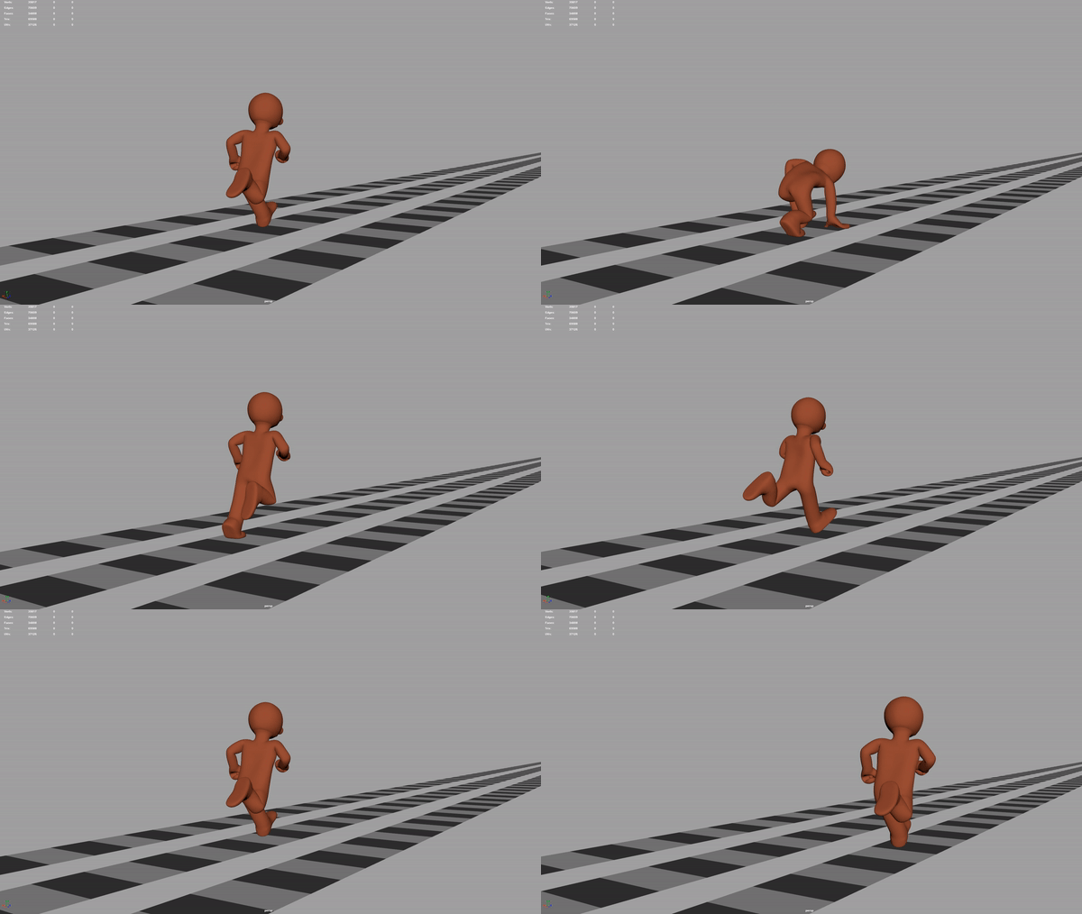
Animations in Maya, before they get exported to Unity and adjusted to make them more responsive.
The thing is, in games, you have to be really, really careful about much of that ‘anticipation’ you put into an animation. If the player wants their character to do something, then for the most part, that action needs to be performed almost instantaneously. If a player in Thingy-Ma-Bobstacle Course sticks out their left arm to tell Morph to jump left – that needs to happen quickly, otherwise the player might end up seeing the game over screen, and Morph might end up finding out what a treadmill tastes like!
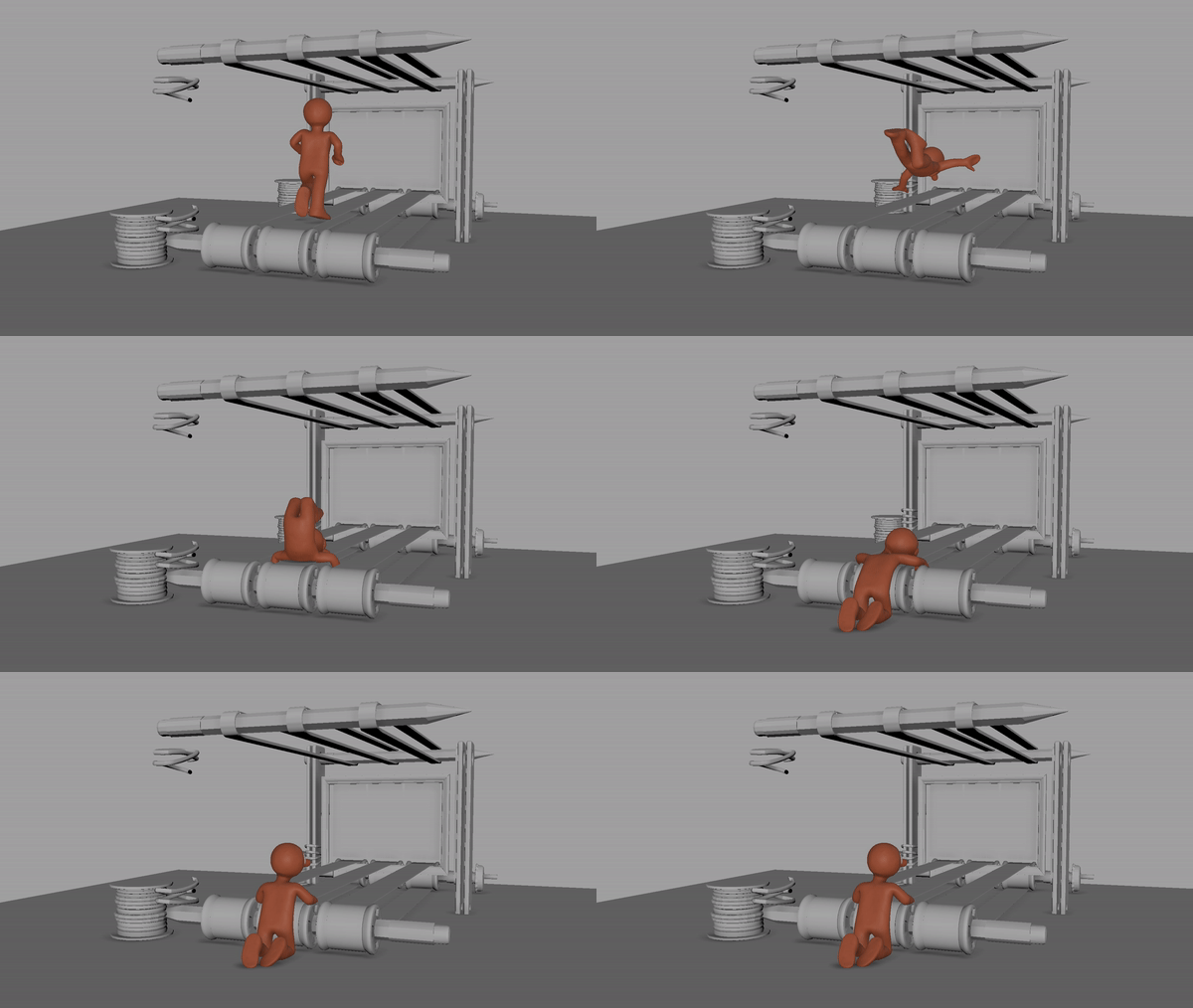
A blockout of the ‘trip’ animation.
To keep a balance, we made sure that the animations Inez was creating maintained the anticipation required to portray the character effectively, albeit slightly shorter than what would be expected in traditional animation. We then adjusted the timings of the animations during the game. If the player asked Morph to move when there was no immediate threat, we played slightly more of the anticipation in the animation. If there was greater threat, and a greater need to move quickly, we made sure to prioritize the portion of the animation where Morph actually moves and not so much of the anticipation. In the end we believe we came up with a Morph that not only looks and feels like Morph, but also works as a game character.
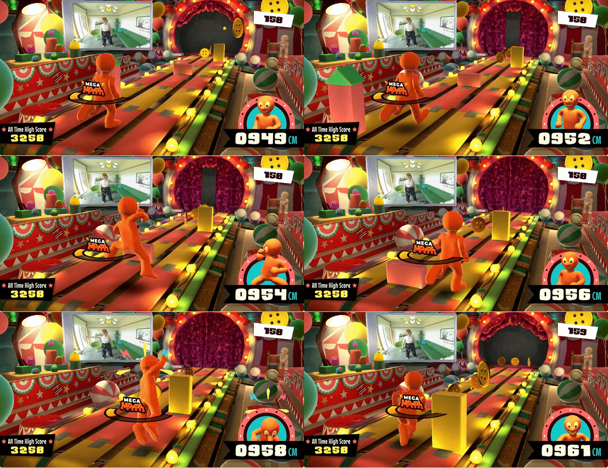
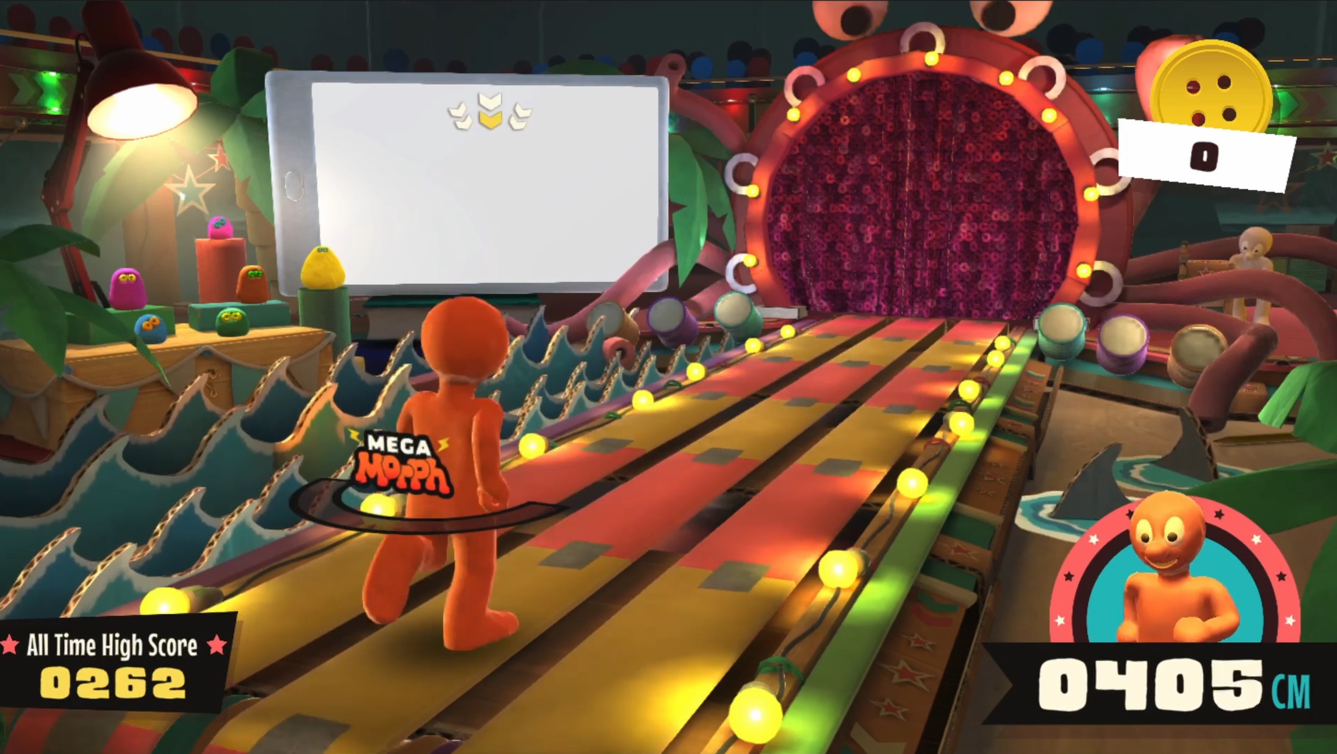
Morph’s animations how they appear in the final game
From design to implementation
As a developer on interactive projects at Aardman, I see my role as someone that facilitates the bringing together all the creative processes required when bringing an interactive project to life, and getting it all into the app or game.
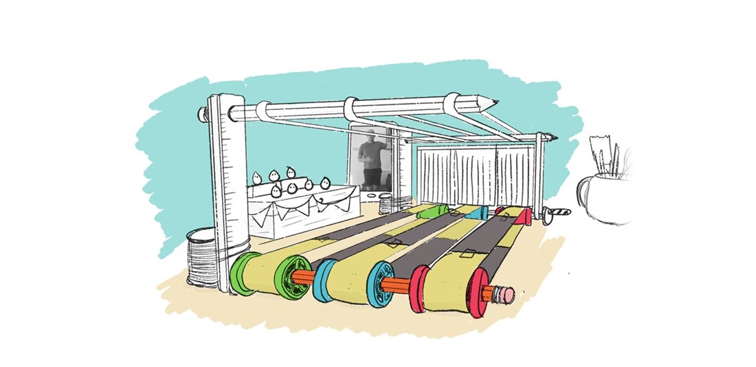
Before anything gets into the game, it often starts off as a drawing.
This involves a process of translation; going from pen and paper design or pushing pixels around in Photoshop to when it gets into the game. You want the creative and design people to feel free that they can make anything they want (within reason!) and it’s your goal as a developer to make sure what they make is replicated as closely as possible in the final piece – in this case, the game.
Let’s take a look at one part of the game, the user interface, and look at what decisions need to be made to get it in to the game...
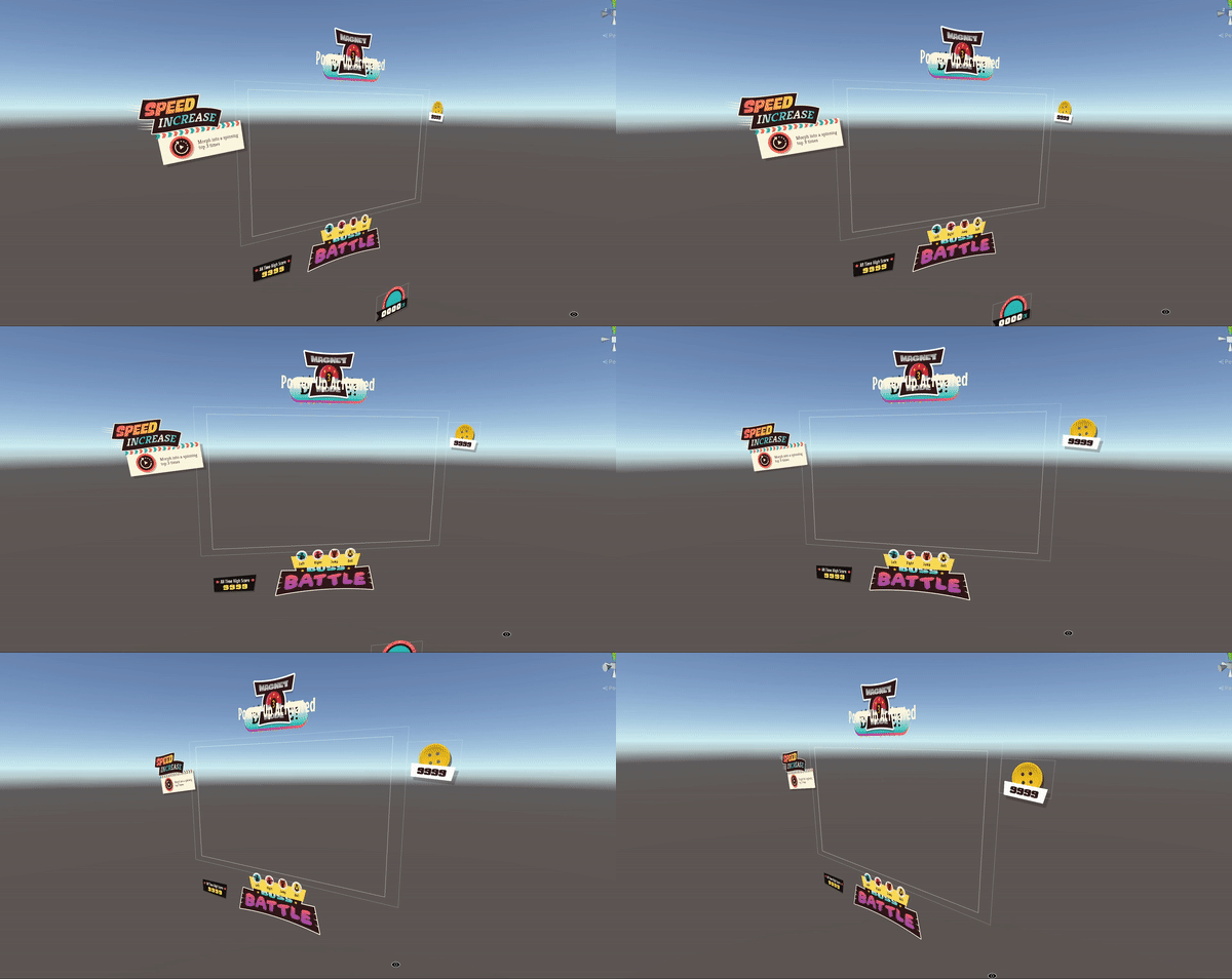
Some of the user interface elements and how they appear in the Unity editor.
2D art, which might be used for user interface elements are generally designed in software like Adobe Illustrator or Adobe Photoshop. To the user, they generally see a ‘flat’ design, a single graphic, but in reality what the user sees on-screen is usually a combination of different layers – carefully exported and re-constructed in-engine so that the intended look and ‘feel’ is what the designer intended.
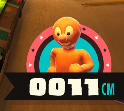
‘Morph cam’ as it appears in game.
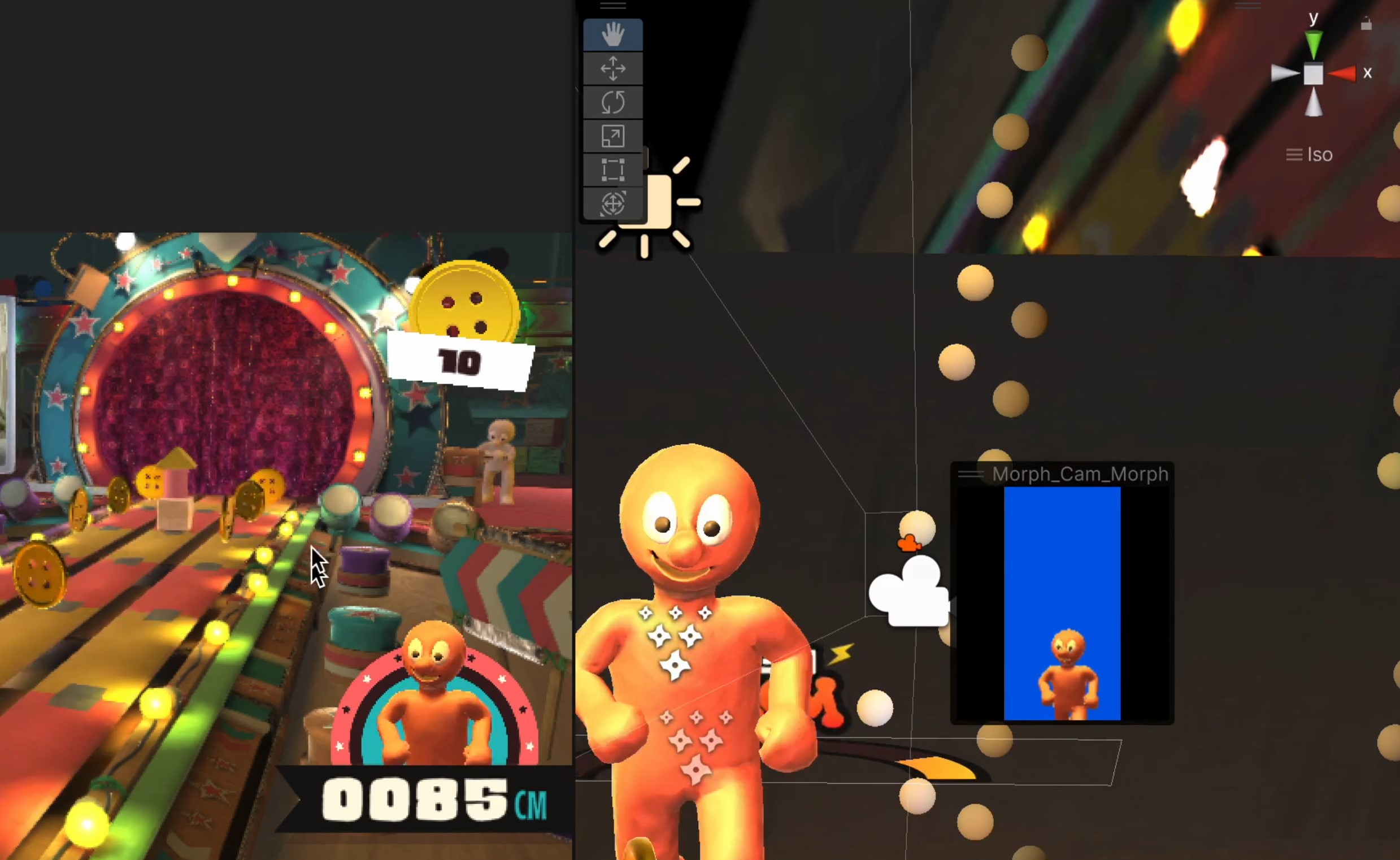
In Morph Thingy-Ma-Bobstacle Course there is a ‘picture-in ’picture’ view, which we call ‘Morph cam’, that shows Morph’s face, along with the current score of the player. It seems pretty simple and straight forward, but there were many decisions that we had to make to get it working as we intended.
Let’s take a closer look at Morph cam...
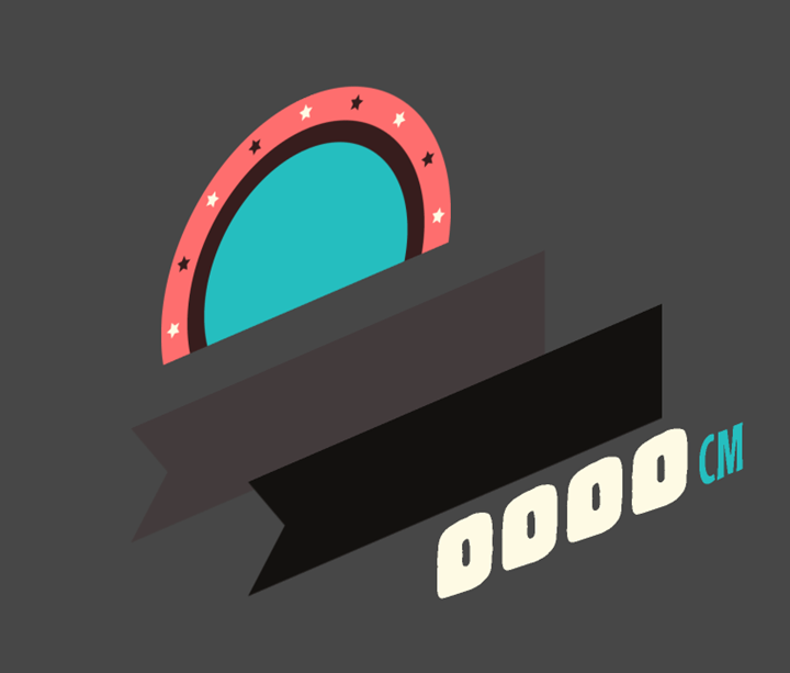
Breaking apart this graphic, you can see that it’s constructed from multiple layered pieces. To get Morph to appear in front of the red and blue circular graphic, but behind the banner, we needed to break what appears as one graphic into multiple parts.
The Morph you see animated in this graphic is the same Morph that is playing in the game. There is a camera pointed at Morph’s head that renders to a special texture, which gets inserted in between the red and blue circular graphic and the black and grey banners.
Morph cam as it appears in game, and how it works behind the scenes.
That's not quite the end of it though. See the two banners which the distance counter sits on? To save space in our games, where possible we like to make our graphics a flat white colour. This allows us to re-colour them in engine and reuse them. Instead of having two separate graphics, one grey and one black, we have one graphic which we colour depending on the use case.

The banner graphic before it gets recoloured.
The decisions we made to get this small piece of the game running are the sorts of decisions we make with every little thing you see within our games.
Creating the world...
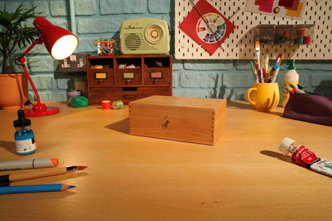
Morph’s ‘real’ world.
The world of Morph has a set of rules associated with it. Essentially, Morph lives in our world. Specifically, he lives on a desktop. Everything that he interacts with has to be found on the desk. By that logic, everything in the world that has been created for Thingy-Ma-Bobstacle Course has to be made from things that Morph, or his pal Chas can get their hands on.
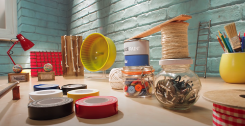
How Morph and Chas would build things in the show.
From the very start the approach to designing the environment of Thingy-Ma-Bobstacle Course was the same approach as how props would be developed for the Morph TV show. If we had to make a treadmill, what would it be made from? What would conceivably be on a desktop that would be used to build such thing? Gavin Strange, the Creative Director on the project, began working out how the game we wanted to make would exist inside the world of Morph.
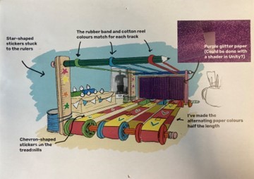
An early sketch of the treadmill that appears in the game.
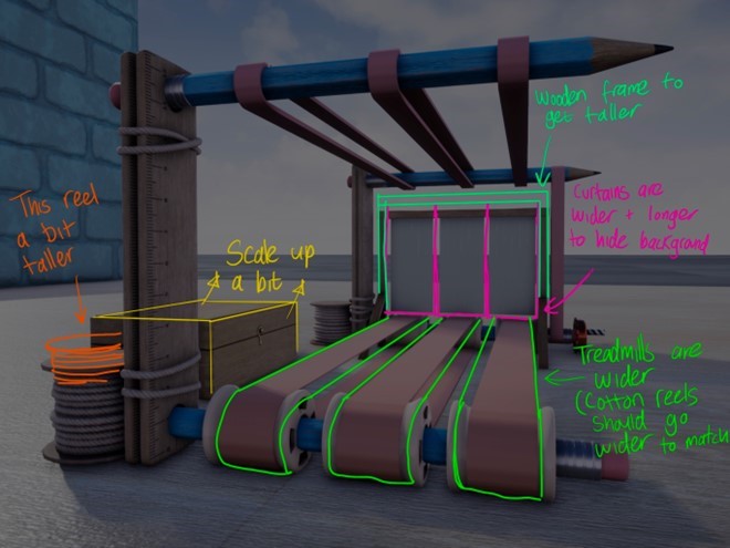
An early 3D version of the treadmill, along with notes for the CG department for required adjustments.
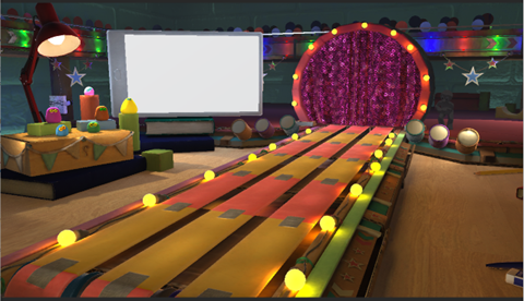
The treadmill become much simpler in the final game, allowing extra space for the level themes to fit in.
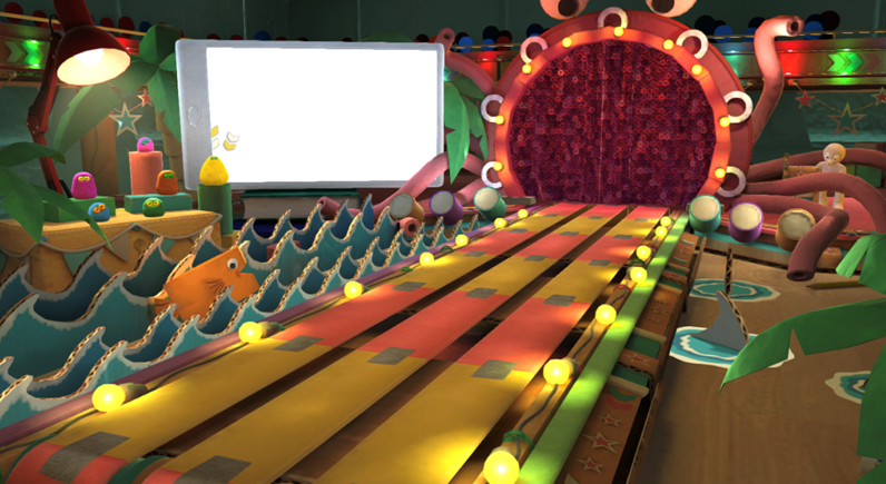
The final environment, including the ‘sea’ biome.
One of the tricks to making the game feel like it takes place in an authentic Morph environment, was to focus on the little details – as we mentioned, everything that exists in the world of Morph has to be something that exists in our world. When watching the show you’d be able to see what everything is made from, and it’s no different in the game.
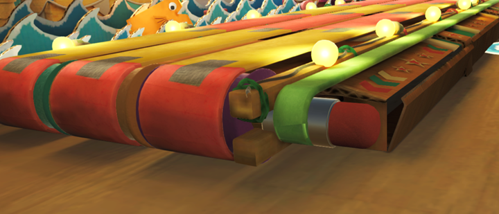
Take a closer look and you’ll see the rubber bands and pencil that drive the treadmill or the painted cardboard that makes the sea in the ocean biome. There are even party-popper confetti cannons!
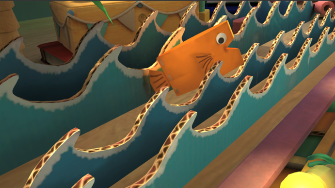
Another important piece to creating the world of Thingy-ma-Bobstacle Course was the way in which different ‘levels’ were introduced in the form of ‘biomes’. Essentially, biomes are different ways of shaking up the visual identity of the environment. Not only do they give the players a fresh new look to the game, but it also acts as a visual representation to the progress they are making. So long as the environment is changing, then the player knows that they are progressing. 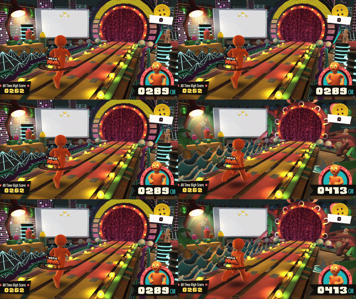
Comparison between the ‘futuristic’ biome and the ‘sea’ biome.
To make the biomes work as intended, we needed to make an environment that had space dedicated to the ‘permanent’ features, such as the stage Chas was stood on, the treadmill, the phone and the Very Small Creatures’ viewing platform. The rest of the space could be dedicated to the ‘biome’ space – which was interchangeable. So long as biomes were constructed to fit within this space, then we could build whatever we wanted – and the art team for the game Codey Dyer, Okera Damani, Shaz Abdullah and Katie Hart did just that!
Morph running through all of the biomes in the game.
Hopefully you enjoyed this look behind the scenes on the making of Morph Thingy-Ma-Bobstacle Course. Developing this game with such an incredibly talented, multi-disciplinary team at Aardman was a special experience. To have the opportunity to bring a beloved character to life in a completely new one was a daunting, but exciting challenge.
